Single Product Template
The Single Product template controls the layout and structure of individual product detail pages. This template determines how customers view product information, images, pricing, and purchase options.
What It Controls
Section titled “What It Controls”The Single Product template applies to:
- Individual product pages (e.g.,
/product/running-shoes/) - All product detail views across your site
- Product permalink pages linked from grids, search results, and categories
Does NOT apply to:
- Product listings or grids
- Search results pages
- Category archive pages
Those use the Product Search Results template instead.
Default Layout
Section titled “Default Layout”Out of the box, the Single Product template includes:
Two-Column Layout
Section titled “Two-Column Layout”Left Column (Images):
- Product image gallery
- Main product image (large)
- Thumbnail navigation
- Lightbox zoom functionality
Right Column (Product Information):
- Product title (H1)
- Product rating and review count
- Product pricing (regular, sale, calculated)
- Product description
- Variant selectors (size, color, etc.)
- Buy button (“Add to Cart”)
Below Columns (Full Width):**
Section titled “Below Columns (Full Width):**”- Product reviews section
- Review form
- Review list (sorted by date)
- Star ratings
- Related products carousel
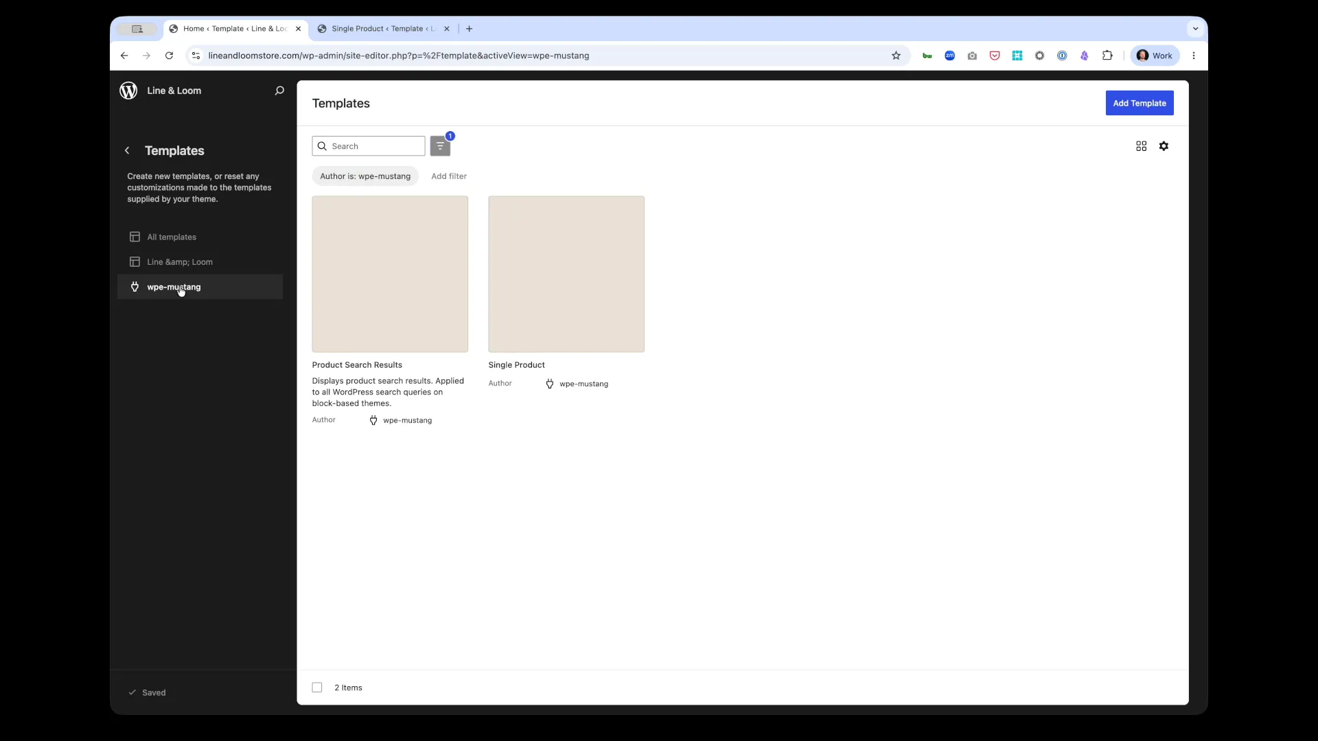
Accessing the Template
Section titled “Accessing the Template”- Navigate to Appearance → Editor in WordPress admin
- Click Templates in the left sidebar
- Filter by “Author is: wpe-mustang” to show Commerce Connect templates
- Click Single Product to edit
Customization Options
Section titled “Customization Options”Layout Structure
Section titled “Layout Structure”Change Column Ratio:
- Default: 50/50 split (images | info)
- Options: 40/60, 60/40, or 70/30
- Adjust by selecting columns block and changing width percentages
Stack on Mobile:
- Default: Images on top, info below
- Reverse order if needed via block settings
- Adjust breakpoint for stacking behavior
Single Column Layout:
- Remove columns block entirely
- Stack all elements vertically
- Better for minimal designs or text-heavy products
Image Gallery Placement
Section titled “Image Gallery Placement”Gallery Position:
- Left (default) - Images on left, info on right
- Right - Images on right, info on left
- Top - Images full-width above info
- Bottom - Images below product info
Gallery Style:
- Thumbnails Below - Main image with thumbnails underneath
- Thumbnails Side - Main image with thumbnails on left/right
- Slider - Carousel with navigation arrows
- Grid - All images in grid layout
Image Size:
- Square - 1:1 aspect ratio
- Portrait - 3:4 aspect ratio
- Landscape - 4:3 aspect ratio
- Custom - Set exact dimensions
Product Information
Section titled “Product Information”Title Placement:
- Move title above/below other elements
- Adjust heading level (H1 default, can change to H2-H6)
- Change alignment (left, center, right)
Pricing Display:
- Stack - Regular price, sale price, calculated price vertically
- Inline - Show prices side-by-side
- Hide regular price - Only show sale/calculated price
- Add “Save X%” badge - Display discount percentage
Description Position:
- Above buy button (default) - Better for product details
- Below buy button - Better for short descriptions
- Tab interface - Use tabs for description, specs, shipping info
- Accordion - Collapsible sections for long descriptions
Reviews Section
Section titled “Reviews Section”Review Placement:
- Below product (default) - Full-width reviews section
- Right sidebar - Show reviews alongside product info
- Tabs - Reviews in tabbed interface with description
- Hide entirely - Remove reviews section
Review Settings:
- Sort order - Newest, highest rated, lowest rated
- Reviews per page - 5, 10, 20
- Form position - Top, bottom, or hidden
- Moderation - Require approval before display
Related Products
Section titled “Related Products”Position:
- Below reviews (default)
- Sidebar - Show related products in right column
- Above reviews - Place before reviews section
- Hide - Remove related products entirely
Display Options:
- Carousel - Horizontal scrolling carousel
- Grid - Static grid layout (2, 3, or 4 columns)
- Product count - How many related products to show (4, 6, 8, 12)
- Criteria - Same category, same tags, manually selected
Common Customization Scenarios
Section titled “Common Customization Scenarios”Scenario 1: Minimal Product Page
Section titled “Scenario 1: Minimal Product Page”Goal: Simple, clean layout with essential info only.
Changes:
- Remove related products section
- Hide reviews (or move to tab)
- Use single-column layout
- Reduce image gallery to single main image
- Simplify description (short, scannable bullets)
Use case: Digital products, services, or simple physical products
Scenario 2: Rich Product Experience
Section titled “Scenario 2: Rich Product Experience”Goal: Maximize product information and social proof.
Changes:
- Add product specifications block (custom fields)
- Enable reviews and display 10+ per page
- Show related products in carousel (8 products)
- Add product video block
- Include shipping/return policy callout
Use case: High-ticket items, complex products, or B2B sales
Scenario 3: Fashion/Apparel Focus
Section titled “Scenario 3: Fashion/Apparel Focus”Goal: Emphasize visuals and variant selection.
Changes:
- 60/40 layout (images larger)
- Image gallery with 6+ product photos
- Prominent variant selectors (size, color swatches)
- Add size guide link
- Show model measurements
Use case: Clothing, shoes, accessories
Scenario 4: Mobile-First Layout
Section titled “Scenario 4: Mobile-First Layout”Goal: Optimize for mobile shoppers.
Changes:
- Stack all elements vertically on mobile
- Fixed “Add to Cart” button at bottom of screen
- Collapse description into accordion
- Reduce image gallery to swipeable carousel
- Hide related products on mobile (performance)
Use case: High mobile traffic sites
Adding Custom Blocks
Section titled “Adding Custom Blocks”Enhance the Single Product template with additional blocks:
Product-Specific Blocks
Section titled “Product-Specific Blocks”Add any Commerce Connect block:
- Product SKU - Display product SKU
- Product Weight - Show shipping weight
- Product Dimensions - Display size info
- Product Brand - Link to brand page
- Product Categories - Show categorization
How to add:
- Click + in template editor
- Search for block name
- Drag to desired position
- Configure block settings
Standard WordPress Blocks
Section titled “Standard WordPress Blocks”Mix in standard blocks:
- Spacer - Add vertical spacing between sections
- Separator - Visual divider lines
- Buttons - Custom CTAs (“Request Sample”, “Contact Us”)
- Columns - Create multi-column layouts for specs
- Image - Add brand logos, certifications, badges
Custom HTML/Embeds
Section titled “Custom HTML/Embeds”Third-party integrations:
- Video embeds - YouTube product demos
- Comparison tables - Spec comparisons
- Trust badges - Security, warranty, satisfaction guarantees
- Social proof - Instagram feed, customer photos
Block Settings
Section titled “Block Settings”Each block in the template has customizable settings:
Product Images Block
Section titled “Product Images Block”Settings:
- Aspect ratio - Square, portrait, landscape, custom
- Gallery layout - Thumbnails below/side, slider, grid
- Lightbox - Enable/disable zoom on click
- Image size - Thumbnail, medium, large, full
- Lazy loading - Improve performance for pages with many images
Product Pricing Block
Section titled “Product Pricing Block”Settings:
- Show regular price - Display original price when on sale
- Show sale badge - “Sale!” badge when price reduced
- Price format - $XX.XX, XX,XX €, etc.
- Tax display - Include/exclude tax in price
- Currency symbol - Before/after price amount
Product Buy Button Block
Section titled “Product Buy Button Block”Settings:
- Button text - “Add to Cart”, “Buy Now”, “Add to Bag”
- Button style - Fill, outline, text only
- Button size - Small, medium, large
- Width - Auto, full-width, custom
- Icon - Cart icon, arrow, none
Product Reviews Block
Section titled “Product Reviews Block”Settings:
- Layout - List, grid, compact
- Sort order - Date, rating, helpfulness
- Show verified badge - Highlight verified purchases
- Review form position - Top, bottom, hidden
- Pagination - Load more, numbered pages
Styling the Template
Section titled “Styling the Template”Via Block Settings (No Code)
Section titled “Via Block Settings (No Code)”Each block has style options:
Typography:
- Font size (small, medium, large, custom px/rem)
- Font weight (normal, bold, 100-900)
- Line height
- Letter spacing
Colors:
- Text color
- Background color
- Link color (normal, hover)
- Border color
Spacing:
- Padding (internal space)
- Margin (external space)
- Gap (space between child elements)
Borders:
- Border width
- Border style (solid, dashed, dotted)
- Border radius (rounded corners)
Via Custom CSS (Advanced)
Section titled “Via Custom CSS (Advanced)”Target specific elements with CSS:
/* Product title styling */.single-product-template .product-title {  font-size: 2.5rem;  font-weight: 700;  color: #1f2937;  margin-bottom: 1rem;}
/* Price styling */.single-product-template .product-price {  font-size: 1.75rem;  font-weight: 600;  color: #059669; /* Green */}
/* Sale price highlight */.single-product-template .product-price--sale {  color: #dc2626; /* Red */}
/* Buy button customization */.single-product-template .product-buy-button {  background: #8b5cf6; /* Purple */  color: white;  padding: 1rem 2rem;  border-radius: 0.5rem;  font-weight: 600;  transition: background 0.2s;}
.single-product-template .product-buy-button:hover {  background: #7c3aed; /* Darker purple */}
/* Image gallery tweaks */.single-product-template .product-images {  border: 1px solid #e5e7eb;  border-radius: 0.5rem;  padding: 1rem;}
Add custom CSS in Appearance → Customize → Additional CSS.
Responsive Design
Section titled “Responsive Design”The Single Product template is responsive by default:
Desktop (> 1024px)
Section titled “Desktop (> 1024px)”- Two-column layout (images | info)
- Large product images
- Reviews in full-width section
- Related products in 4-column grid
Tablet (768px - 1024px)
Section titled “Tablet (768px - 1024px)”- Two-column layout maintained (narrower)
- Smaller images
- Reviews in 2-column grid
- Related products in 3-column grid
Mobile (< 768px)
Section titled “Mobile (< 768px)”- Single-column layout (stacked)
- Images full-width at top
- Info below images
- Reviews in single column
- Related products in 2-column grid or carousel
Mobile Optimization Tips
Section titled “Mobile Optimization Tips”Image gallery:
- Use swipeable carousel instead of thumbnail grid
- Limit to 5-6 images on mobile
- Lazy load images below fold
Product info:
- Collapse description into accordion (“Read More”)
- Make variant selectors larger (easier to tap)
- Sticky “Add to Cart” button at bottom
Reviews:
- Show 3-5 reviews, add “Load More” button
- Hide review form on mobile (link to separate page)
- Simplify review layout (remove avatars, etc.)
Best Practices
Section titled “Best Practices”Design
Section titled “Design”Visual Hierarchy:
- Product title largest and most prominent
- Price second most prominent
- Buy button stands out with contrasting color
- Description readable but secondary to visuals
Whitespace:
- Don’t overcrowd the page with too many elements
- Use spacer blocks to add breathing room
- Maintain consistent spacing between sections
Mobile-First:
- Design for mobile first, enhance for desktop
- Test all interactions on actual mobile devices
- Ensure buttons are large enough (44px × 44px minimum)
User Experience
Section titled “User Experience”Fast Loading:
- Optimize images (BigCommerce serves optimized images automatically)
- Limit number of related products on mobile
- Use lazy loading for images and reviews
Clear CTAs:
- Buy button should be visible without scrolling
- Use action-oriented text (“Add to Cart” not “Buy”)
- Show stock status clearly (in stock, low stock, out of stock)
Build Trust:
- Show customer reviews prominently
- Display security badges (SSL, payment logos)
- Include return/shipping policy links
- Show product rating near title
Structured Data:
- Commerce Connect automatically adds Product schema
- Includes: name, image, price, availability, rating
- Validates with Google Rich Results Test
Content:
- Write unique product descriptions (not manufacturer copy)
- Use headings (H2, H3) to structure long descriptions
- Include keywords naturally in title and description
- Add alt text to all product images
Performance:
- Fast page load = better rankings
- Use WP Engine Full Page Cache
- Optimize images for web
- Minimize custom JavaScript
Testing Your Template
Section titled “Testing Your Template”Preview Changes
Section titled “Preview Changes”- Make changes in Site Editor
- Click Preview button
- Open preview in new tab
- Test with different products
- Check variant selection, add to cart, reviews
Test on Multiple Devices
Section titled “Test on Multiple Devices”Use browser responsive design mode:
- Open preview in browser
- Press F12 (dev tools)
- Click Toggle device toolbar icon
- Test on:
- iPhone (375px width)
- iPad (768px width)
- Desktop (1440px width)
Test Functionality
Section titled “Test Functionality”Product page features:
- ✅ Image gallery navigation works
- ✅ Lightbox zoom functions
- ✅ Variant selectors update price/image
- ✅ Add to Cart button adds product
- ✅ Reviews display and sort correctly
- ✅ Related products link to correct pages
- ✅ Mobile layout stacks properly
Browser Testing
Section titled “Browser Testing”Test in multiple browsers:
- Chrome (desktop + mobile)
- Safari (desktop + iOS)
- Firefox
- Edge
Troubleshooting
Section titled “Troubleshooting”Template Changes Not Appearing
Section titled “Template Changes Not Appearing”Solution:
- Ensure you clicked Save in Site Editor
- Clear site cache (WP Engine cache, CDN cache)
- Hard refresh browser (Cmd+Shift+R or Ctrl+Shift+R)
- Verify you edited “Single Product” not another template
Buy Button Not Working
Section titled “Buy Button Not Working”Solution:
- Check if product is in stock
- Verify BigCommerce connection is active
- Check browser console for JavaScript errors (F12)
- Test in incognito mode (rule out cache/plugins)
Reviews Not Displaying
Section titled “Reviews Not Displaying”Solution:
- Verify product has reviews in BigCommerce
- Check if reviews synced to WordPress (Commerce Connect → Products)
- Ensure reviews block is not hidden via CSS
- Check review moderation settings (may be pending approval)
Images Not Loading
Section titled “Images Not Loading”Solution:
- Check if images exist in BigCommerce
- Trigger product sync (Commerce Connect → Settings → Data → Sync Products)
- Verify image URLs are not blocked by firewall/CDN
- Check browser console for 404 errors
Layout Broken on Mobile
Section titled “Layout Broken on Mobile”Solution:
- Check column block settings - ensure “Stack on mobile” enabled
- Test in actual mobile browser (not just responsive mode)
- Review custom CSS for mobile overrides
- Verify theme supports Full Site Editing properly
Advanced Customization
Section titled “Advanced Customization”Conditional Content
Section titled “Conditional Content”Show/hide elements based on product attributes:
Example: Show size guide only for apparel
Section titled “Example: Show size guide only for apparel”Use custom CSS to hide by default, then show for specific categories:
/* Hide size guide by default */.size-guide-block {  display: none;}
/* Show for apparel category */.product-category-apparel .size-guide-block {  display: block;}
Custom Product Fields
Section titled “Custom Product Fields”Display custom fields from BigCommerce:
- Add custom fields in BigCommerce admin
- Fields automatically sync to WordPress
- Use custom HTML block to display:
<div class="custom-field"> <strong>Material:</strong> <span>{{product.custom_field_material}}</span></div>Product Tabs
Section titled “Product Tabs”Create tabbed interface for description, specs, reviews:
- Add Tabs block (from theme or plugin)
- Create 3 tabs: Description, Specifications, Reviews
- Move product blocks into respective tab panels
- Style tabs to match your theme
Related Documentation
Section titled “Related Documentation”- Templates Overview - All Commerce Connect templates
- Product Search Results Template - Search and listing pages
- Blocks Overview - All available Commerce Connect blocks
- Product Reviews - Review management and moderation
- Product Sync - How BigCommerce data syncs to templates
Next Steps
Section titled “Next Steps”- Customize your Single Product template layout
- Customize Product Search Results template →
- Explore all available blocks →
- Test your store’s shopping experience →